
Custom Dashboards
CyberSecurity / Interaction Design / Design System
For this project, the first task was to build a data viz library that would be valuable and consumable by other development teams in the company. The priority switched for the team to create customizable dashboards to cater to the data visualization and allow users to customize the layout to their needs. The goal for our team was to research, design, and develop the new feature for the client’s product on top of finishing the data viz library.
As a result, the team successfully delivered a customizable dashboard experience with additional enhancements for future iterations. Additionally, the team added a Data Viz library to the Design System for designers and developers to reference.
My Role
Methods & Skills
Competitive Analysis
Wireframing
Prototyping
UI Design
Interaction Design
Design System
Data Viz
Flexbox
Tools
Figma
Jira
Confluence
Miro
Timeline
March 2021 - Sept 2021
I was one of the UX designers on a team of two other designers, a scrum master, two product people, five developers, and two QA testers. My responsibilities included wireframing, creating mid to high-fidelity mockups, and prototyping the interactions. I also contributed to the design system by adding the data viz library and guidelines.
Design Challenge
Because the current dashboard experience had no customization, users couldn't dig deeper into the data. Data visuals were unclear, resulting in customers exporting the data and importing it into another system. Their day-to-day routine consisted of sifting through multiple pages in the product, then using resources outside to identify cyber threats.
The Process

Understand
Competitive Analysis
While onboarding, I assisted the UX Researcher in some competitive analyses. We looked at five direct competitors and evaluated them on customization, performance, data access, simplicity to understand, and layout of information. We specifically looked at the Dashboard experiences.
Define

Explore
Wireframes
We thought big when creating the wireframes for custom dashboards. We knew it would be easier to pair down the design if needed. I created wireframes for an “Edit Mode” while the other designer on the team looked at the “Non-Edit Mode.” Some areas of interactions we thought to include:
-
How do you create a dashboard?
-
How to add, edit and move widgets?
-
How to edit the layout of the dashboard?


Explore
Key Screens + Functions
We did a lot of exploration for the interaction of custom dashboards. Each week we had a design review where we presented the design options to the client and collaborated with them on the best solution. Some highlights of designs are below:
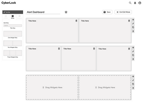
Main Dashboard Layout
The client used flexbox for responsiveness. Instead of adjusting widgets by breakpoints, we provided three layout options that filled the viewport width.

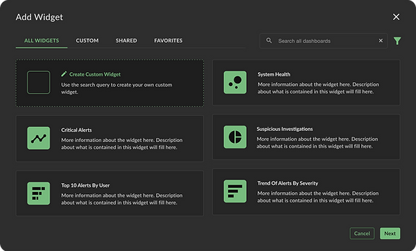
Adding a Widget
For MVP, the Add Widget Dialog only included “out-of-the-box" widgets. Our team did provide a few options for how this dialog could expand in future iterations. We provided design flows for creating custom widgets, favoriting widgets, and filtering when the list expands.

Post MVP Designs

Moving a Widget
Discussing widget movement was one of the most challenging topics for our team. There was a lot of debate about how widgets should move in the dashboard. For those conversations, we create low-fidelity mockups to demonstrate how widgets move and how they appear when added. Each widget was clearly labeled with a letter and color to avoid confusion.


Materialize
Development + QA Testing
Each week the whole team would meet to groom user stories. It was a great time for development and design to collaborate and discuss any technical constraints. After development, QA would test the current designs and reach out with any issues or gaps they found.
Materialize
Data Viz Library
On top of the dashboard work, our team created a data viz library for the client’s design system. This work included: building the different chart types in the Figma library, designing tooltips, determining chart responsiveness, and animation.

Documentation
For each chart, we wrote usage guidelines including information like: uses, best practices, do's and dont's, anatomy, hover States, tooltip usage, legend Usage, interactivity, chart responsiveness, and more.

Data Viz Color Palette
While on this project, I had the opportunity to collaborate with the Design System team to create data viz color palettes. Because I had already started exploring accessible color palettes, I shared my research findings with the Design System team. To see the data viz color work click the button below.

Results & Reflection
Within six months, the team successfully delivered an MVP for Custom dashboards and created data viz components and guidelines for the Design System. The team designed a lot of explorations for the custom dashboard work that was out of scope. We handed these explorations off to the client as a reference for future updates.
Unfortunately, it took a while for the custom dashboard work to appear in their product. By the time it was live, the team had rolled off. Fortunately, I moved to the design system team for the client and saw the design in production. Soon after, the client had a dedicated in-house designer to work on the custom dashboards. They mentioned the design explorations we left were very helpful for their updates and I answered any questions they had.